Remember learning Roy G. Biv in school? That colorful acronym helped many of us memorize the hues of the rainbow — red, orange, yellow, green, blue, indigo, and violet. While we’ve long since moved on from Mr. Biv, acronyms are still essential in the world of design — especially when it comes to color. Knowing what they mean can help you make informed choices for your print projects. Three of the most common acronyms you’ll encounter in graphic design are RGB, CMYK, and PMS
RGB is an additive color mode, while CMYK is subtractive.
RGB
RGB – Red, Green, and Blue – is an additive color model used to create a wide range of colors by combining light. When all three are mixed in equal amounts, the result is white. RGB is commonly used in digital formats where light is the source, such as:
- Website design
- Social media graphics
- Mobile app interfaces
- Digital ads
- TV and video production
- Any screen-based display (LCDs, LEDs, monitors, etc.)
Pro tip: Design software like Adobe Photoshop often defaults to RGB mode. If your design is intended for print, be sure to switch to CMYK during the prepress stage.
CMYK
CMYK – Cyan, Magenta, Yellow, and Key (Black) – is a subtractive color model, meaning colors are created by removing (subtracting) light. The more ink you add, the darker the color gets. The “K” is widely believed to stand for “key,” referencing the plate used for black ink details in printing.
CMYK is the standard for professional printing and works best for:
- Business cards, brochures, and flyers
- Posters, signage, and packaging
- Magazines, newspapers, and books
- Product labels and tags
- POP displays and aisle markers
Why it matters: What looks vibrant on screen in RGB may print differently in CMYK. Always preview or proof your colors before finalizing a print job.
“Printed graphics look best in CMYK.”
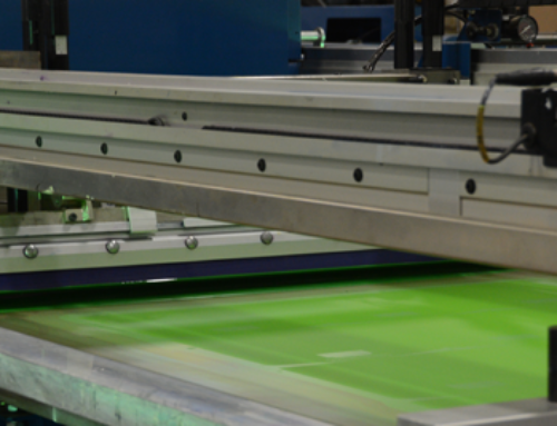
While the RGB model is best for web design, the printing industry uses CMYK to print printed graphics like posters, POP signage and aisle markers. High quality digital printing presses like our Inca Onset Q40i have additional color pigments like light magenta and light cyan (CMYK+LmLc) to expand their color gamut and have smoother color transitions which greatly benefit areas like flesh-tones. A common mistake among new designers is to start creating a graphic using one model and, depending on whether the image is designed for print or web, switching to the other once finished. Unfortunately, RGB and CMYK have subtle differences, and switching modes at the end of the design process alters the look of your artwork. Before starting a new project, make sure the color mode aligns with the prepress requirements of your printing partner.
One of the most frequent missteps new designers make is starting a design in the wrong color mode. For example, creating an image in RGB and then converting it to CMYK at the end of the process can cause unexpected color shifts. That’s because RGB and CMYK interpret colors differently — what looks vibrant on screen might appear duller in print.
Pro Tip: Always confirm your project’s final format (print or digital) before you begin. This helps ensure your color mode aligns with your printer’s prepress requirements and avoids last-minute surprises.

PMS (Pantone Matching System)
PMS is the only acronym of the three that doesn’t refer to a color model. Instead, it stands for Pantone Matching System—a standardized method for ensuring color consistency across different printers, materials, and machines.
Rather than mixing colors like RGB or CMYK, PMS uses pre-mixed spot colors created using precise pigment formulas. The system, developed in the 1960s, defines more than 1,100 spot colors that printers and designers can reliably reproduce.
Without this consistency, it would be nearly impossible to ensure your brand colors look the same on a business card, banner, or t-shirt.
Why PMS Matters for Branding
Using PMS is critical when brand consistency is a top priority. For example, if your brand uses a specific shade of green, PMS allows you to select and reproduce that exact color—without relying on screen or print variations.
This is especially important when exact color consistency is needed — for example, in corporate branding, logos, or uniforms. Using PMS ensures that your brand’s signature color looks the same across business cards, signage, packaging, and apparel.
By contrast, CMYK printing approximates colors using combinations of cyan, magenta, yellow, and black. While it works well for many applications, CMYK can struggle with accuracy in colors like neon, pastels, and metallics — making PMS a more reliable option when color precision is non-negotiable.