Spring is in full bloom across the country. In addition to buds and bulbs sprouting from tree limbs and flower beds, ball games, cyclists and pedestrians are virtually everywhere you look. That makes this time of year a great one to update or upgrade your outdoor signage.
You probably know about some of the most important components to ensuring your signage is not only read, but remembered. It involves the utilization of big, bold lettering, proper positioning and the appropriate material for your environment. You also likely know about color contrasts and how certain hues pair better than others (e.g. Yellow on red background is great, but blue on black? Not so much).
Outdoor signage is exposed to constant sun, wind, and weather—which means color fading is inevitable over time. But with smart design and the right materials, you can dramatically extend the life and vibrancy of your signage. Here we’ll discuss how to protect your investment and keep your message looking sharp.
How to Make Your Outdoor Signs Easy to Read and Hard to Miss
You’re likely familiar with the core principles of great signage—clear, bold lettering; strategic placement; and materials suited for the environment. Color contrast also plays a huge part in visibility. For instance, yellow on a red background can be eye-catching from a distance, while something like blue on black might be difficult to read in low light.
Regularly reviewing and refreshing your signage helps ensure it’s doing its job—being seen, being read, and being remembered.
Outdoor signage is exposed to constant sun, wind, and weather—which means color fading is inevitable over time. But with smart design and the right materials, you can dramatically extend the life and vibrancy of your signage. Here we’ll discuss how to protect your investment and keep your message looking sharp.
“No color takes more of a beating than red.”
All too frequently, however, people fail to account for a common consequence of outdoor signage: fading colors. Over time, particularly in sunny areas, the pigmentation used in symbols, lettering and pictures don’t appear quite as brilliantly as first printed and some colors fade faster than others, mainly due to sun fading. Temperature extremes increase sun fading and tend to exacerbate the effects of fading colors as well, with no color taking more of a beating than red. When designing a long term outdoor sign, don’t be surprised to see any colors with red and yellow pigments fade faster than blue and green pigments. It’s an unfortunate problem that happens everywhere no matter how it’s printed.
How can you ensure your various shades of red continue to turn heads? Everything with pigment fades with time which includes printed signs, paints, and plastics. Here are a few pointers to consider in your signage strategies that can keep your brights brilliant for as long as possible.

Why Outdoor Sign Colors Fade—and What You Can Do About It
One of the most overlooked challenges in outdoor signage is color fading. Over time—and especially in sunny or high-temperature environments—the vibrant colors used in your signs can lose their brilliance. UV exposure gradually breaks down pigments in printed graphics, paint, and plastics, dulling the visual impact of your signage.
Some colors are more vulnerable than others. Reds and yellows tend to fade the fastest, while blues and greens typically hold up longer. Temperature extremes only make the problem worse, accelerating the fading process—particularly in signs that face prolonged sun exposure.
So how can you keep those bold reds and bright accents from blending into the background? While all pigments will fade eventually, there are smart design and material choices that can help your signage stay vivid for the long haul. Here are a few tips to consider when planning for durability.
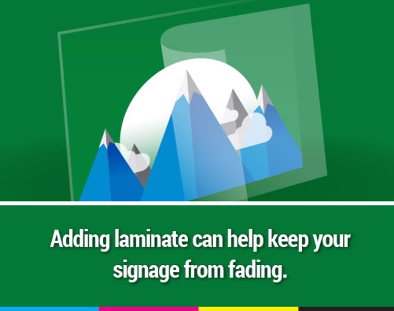
1) Protect Signage with UV-Resistant Laminate
Laminate does a few things for signage. For starters, it provides an extra layer of protection from the elements – dust particles and various allergens included. It also adds a nice sheen to the substrate material that infuses the signage with a more professional, polished look to it. Laminate is especially useful in slowing the effects of fading colors by serving as a see-thru shield that guards adds a level of UV ray deflection and general wear and tear.
2) Avoid South-Facing Placement for Outdoor Signs
You want your display to be in an area that draws the most attention. If at all possible, though, see if you can place it facing any direction other than south. Of course, the sun rises in the east and sets in the west but south facing signs get hit by UV light all day and especially when the UV rays are the strongest. In the early morning hours and twilight, UV rays from the sun tend to be at their weakest. If you’re unsure of which way your signage will point, have a compass handy prior to installation. Most iPhone models should have one built in.
 Laminate is a good investment for your company.
3) Choose Screen Printing for Long-Lasting Color
Seek out a company that offers screen-printed graphics. One of the advantages of screen printing over other methods is that special additives can be added to the ink formulations to make them work better for the application. Particularly, if you desire a long lasting outdoor graphic, be sure to request the inclusion of UV inhibitors to the inks to help prevent fading and prolong the life. Screen printing is preferred also because it lasts longer than digital printed signage since it can deposit more ink onto the substrate, which means there is more color.
4) Use Vertical Orientation to Reduce Sun Exposure
When you have a choice of how the sign is orientated in use (sidewalk graphic or window poster), elect for the window poster. Graphics that are oriented vertically will last longer than signs in a horizontal orientation. The best example is when you are in the sun, your legs don’t get sunburned as much as your shoulders do, which are horizontal. The reduced amounts of direct sunlight will help preserve the vividness of your chosen hues.
5) Partner with a Signage Expert for Material Guidance
Whichever printing company you partner with, ensure they keep you in the loop about all the techniques and equipment used throughout the process. They understand the importance of rich, radiant colors and ought to have the tools necessary to preserve brightness, regardless of what colors you select. For example, they should be able to help select a substrate material that will work best based on the colors, application and the environment in which your signs will be placed. They should also have UV inks available that specialize in fade resistance.
6) Plan for Sign Replacement Based on UV Exposure
All long-term outdoor signage needs to be replaced on a regular schedule no matter how it’s made or made on. Depending on the circumstances, some need to be replaced more frequently. To keep your graphics looking sharp, consider planning on replacing prints that are particularly red or yellow intense on an accelerated refresh cycle. Even further, depending on how much UV exposure the sign receives (e.g. cloudy Seattle vs. sunny Arizona) you may need to accelerate the replacement even faster!
Color fading is inevitable but following these tips will help slow down the fading process. To grab your current or prospective customers’ attention, you need a printer you can trust. Hopkins Printing built a reputation on high-quality screen printed and digital graphics for more than 50 years. Our state-of-the-art techniques are unparalleled and we never stop looking for ways to impress our customers by developing the lawn signs, window graphics and pole signs that make a lasting impression.
For customer satisfaction that won’t fade away, contact Hopkins Printing today.