PortfolioNGS-admin2024-04-18T15:37:05-05:00
-
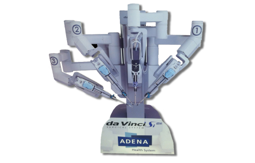
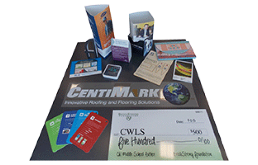
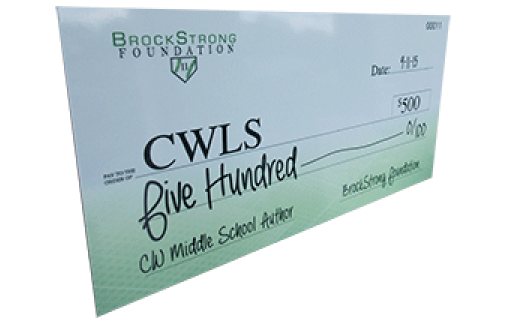
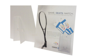
Actual Product Size Cut-out Display

-

-
Annual Report

-
Annual Report-2011

-
Annual Report

-
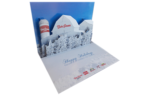
Pop-up Holiday Card

-
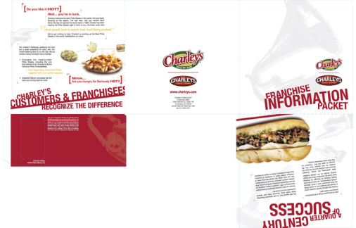
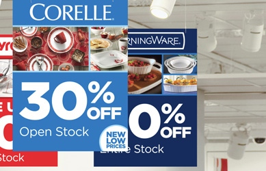
Brochure

-
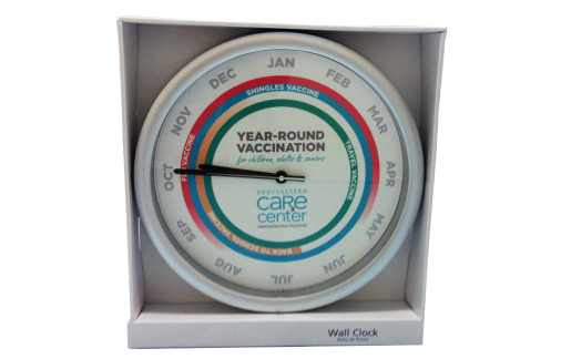
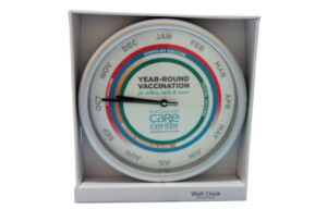
Refaced Clock
-
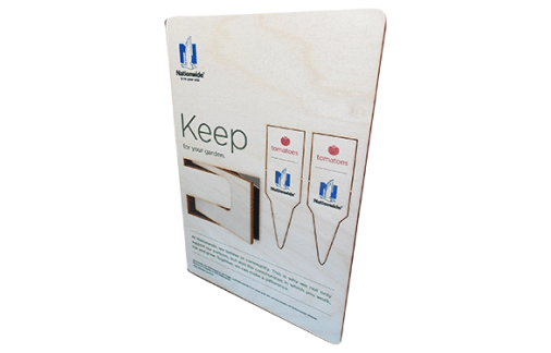
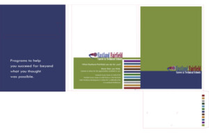
Pocket Folder

-
US Open Sign
-
Program

-
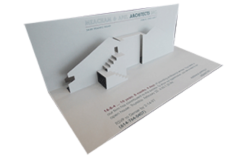
Invite

-
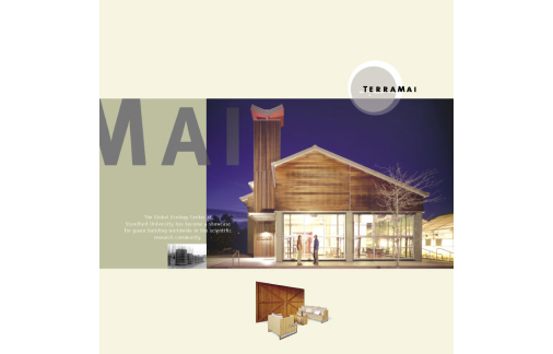
Brochure

-
Brochure

-
Pocket Folder
-
Dinner Menu

-
Brochure

-
-
Executive Summary

-
Admissions Book

-
Pocket Folder

-
Sales Aid

-
Foldover Mailer

-
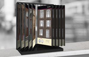
Catalog

-
Book

-
New York/Ireland Pop-up

-
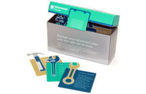
Toolbox
-
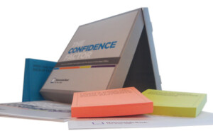
Confidence Factor Kit
-
Pocket Folder

-

-
Brochure

-
Brochure

-
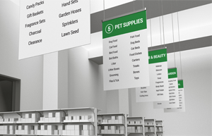
Header Sign