Each color in your graphic conveys a different mood, and the way you combine them can make or break your image. While you might not be the one designing a particular poster or hanging sign, an understanding of color lets you create more effective campaigns and give designers guidelines that make sense.
The basics of color theory
Color theory is built around the color palette wheel. Imagine a rainbow stretched to form a circle. Each hue flows into the next, with purple transitioning back into red. Keep in mind that indigo is removed from the most basic color wheels, resulting in six different hues instead of seven. However, you can divide a wheel into as many segments as you wish, as long as the result is an even split. A simple wheel that provides ample variety is segmented into twelve sections, so the entire circle includes:
- Red.
- Red-orange.
- Orange.
- Orange-yellow.
- Yellow.
- Yellow-green.
- Green.
- Green-blue.
- Blue.
- Blue-purple/indigo.
- Purple.
- Purple-red/magenta.
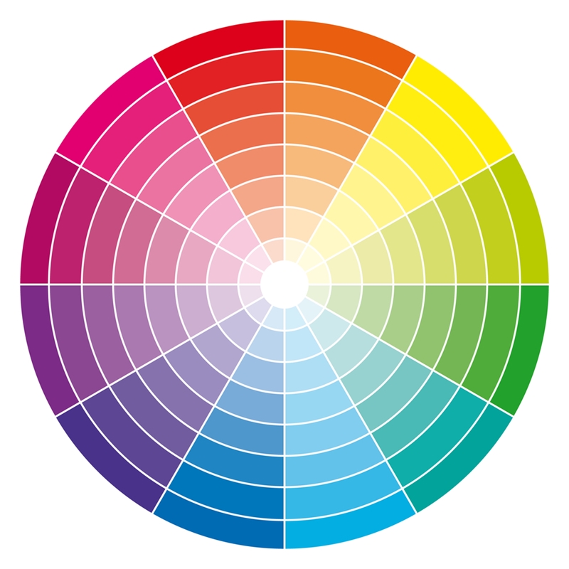
A basic color wheel has 12 hues to which you can add white or black.
With these different shades, you can create the majority of color schemes below:
- Monochrome uses varying shades of one hue to create an image – think of gray scale or sepia pictures. Monochrome schemes are the easiest to create and are automatically harmonious, but they can quickly become boring.
- Complementary schemes involve two hues that sit on opposites sides of the color wheel. Red and green are arguably the most well-known complementary color scheme, but blue/orange and yellow/purple are also quite common.
- Analogous incorporates two or more colors that fall next to each other on the color wheel – for example, yellow, green and blue in a six-color wheel. Analogous colors are common in nature. Sunsets, which incorporate varying shades of purple, red, orange and yellow, are just one example of a natural analogous palette.
- Split analogous uses every other color instead of the ones next to each other. In a 12-hue color wheel, blue, purple and red make a split analogous scheme.
- Split complementary uses a complementary palette but incorporates three colors instead of two. To use this scheme, select one color, then chose the two others that sit on either side of the original’s complement. To illustrate, a split complementary palette with yellow would include indigo and magenta instead of pure purple.
- Triad palettes use three colors equidistant from each other on a wheel. Red-yellow-blue and orange-green-purple – the primary and secondary colors – are the simplest examples of a triad color scheme.
- Tetrad schemes combine two sets of complementary colors. These are overwhelming if you’re not careful, especially if you try to give each color the same amount of space within a printed graphic. Instead, select a single hue as the dominant one and use the rest as accents.
- Neutrals – whites, browns, grays, blacks and their deviations – go together by default. Neutrals convey starkness, elegance and minimalism, but like monochrome colors, they can come across as boring if done wrong. Throw in an accent color to make a neutral palette more exciting.

Tools to create interesting color palettes
The color wheel can be split almost infinitely, creating thousands, if not millions, of hues. It’s hard to develop a truly harmonious palette with so many color possibilities. Complicating things further is the fact that a single color can be varying degrees of light, dark, muted and saturated. Thankfully, there are free online tools to help new and experienced designers alike generate beautiful color schemes.
- Adobe Color CC is a free, easy-to-use web application that allows you to create a palette of five colors. Simply set your scheme and drag the icons around the color wheel. If you have an Adobe ID, you can name and save different palettes – known as themes – to your account.
- Paletton is similar to Adobe Color but uses a different interface.
- Coolors is the simplest tool. Instead of selecting one color yourself, simply press the space bar and cycle between different palettes. Once you’ve settled on one you like, you can adjust the hue, saturation and bright of each particular color. Coolors also has a handy Google Chrome extension and iOS app. It’s also available as an Adobe add-on.